

Nest Thermostat
Redesign.
Redesigning temperature control, room selection, and scheduling across the thermostat and its companion app.
See the product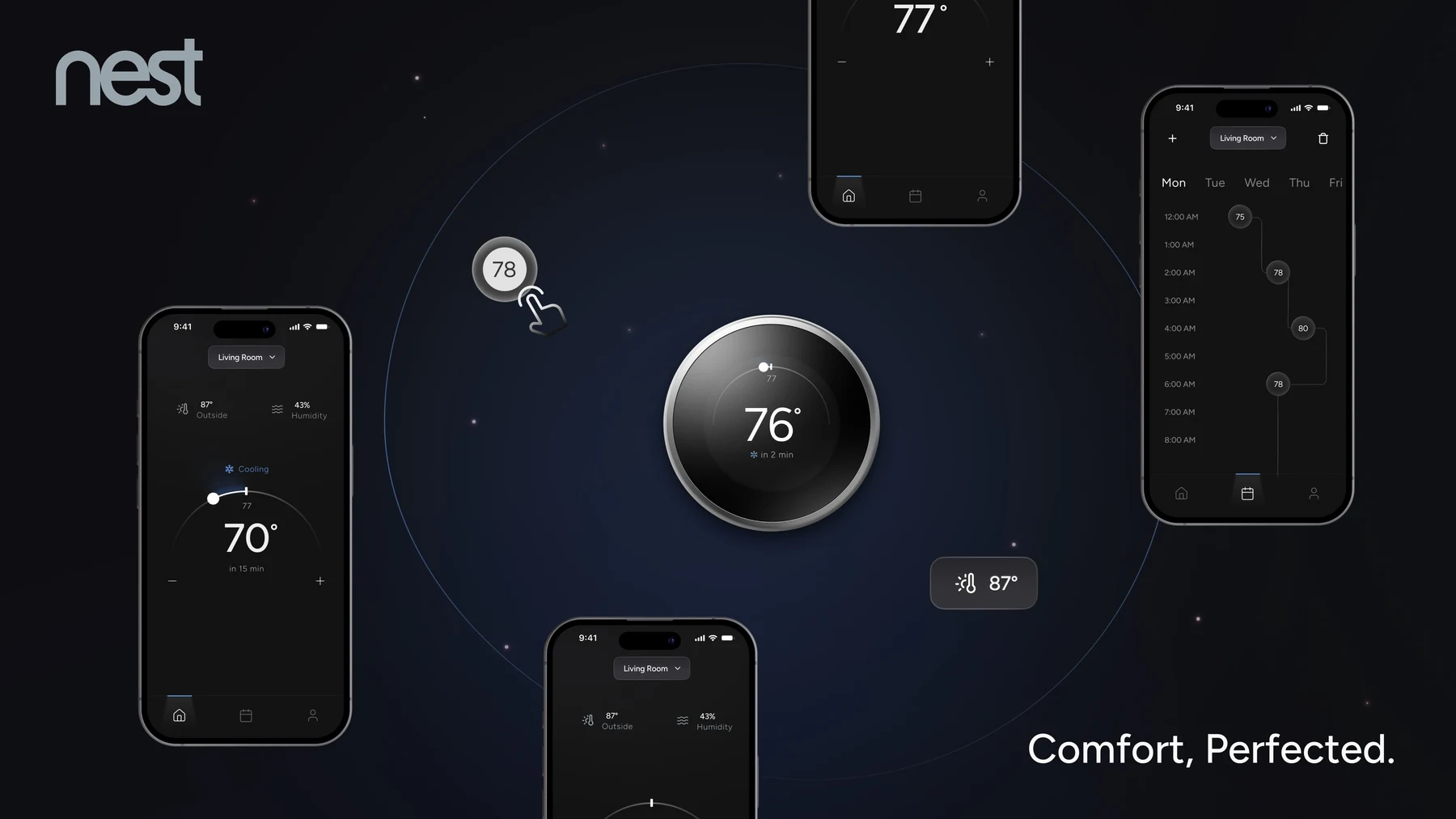 Thermostat & mobile / final concept
Everyday control.
A new expression.
Checking the temperature should take a glance. Setting a schedule needs room to choose a day, adjust temperatures, and review the routine. This independent redesign explores both tasks across the third-generation Nest thermostat and its companion app.
Goal
Keep temperature control immediate and scheduling easy to follow, within a contemporary, premium visual identity.
Approach
Translate comparative visual research into interface criteria, then develop wireflows, screens, and a shared component system.
Outcome
Two connected prototypes covering temperature control, room selection, and scheduling.
Understanding
the Nest.
Research methods / comparative design analysis
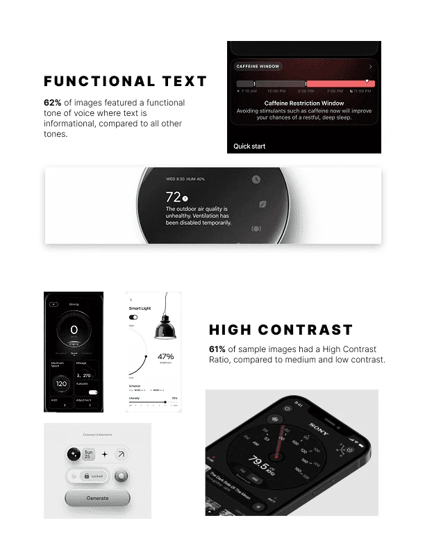
What makes an interface feel high-end? The research began with a wide visual collection, narrowed into a set of references, then compared across specific design facets.
A visual direction
with a purpose.
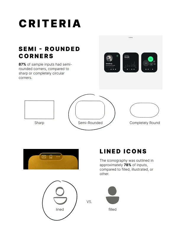
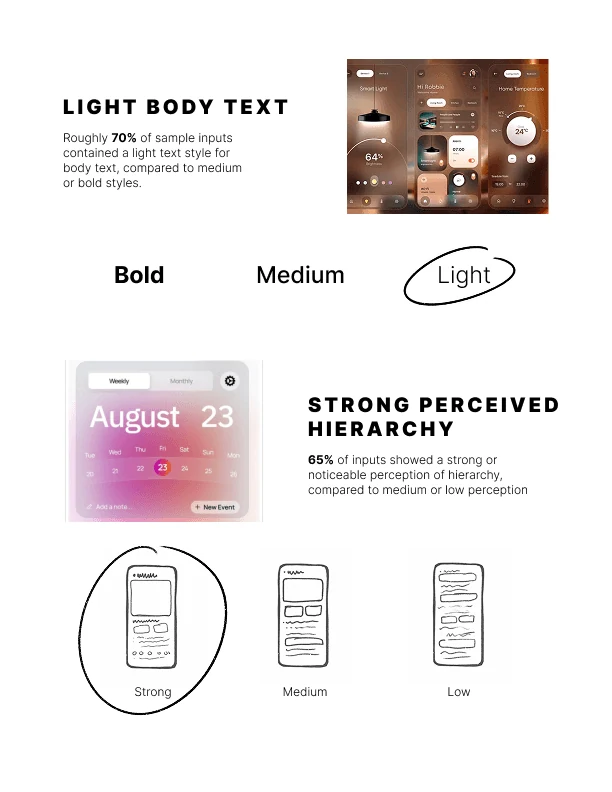
The analysis explored rounded corners, line icons, light typography, strong hierarchy, and high contrast. Dark surfaces and a restrained palette became recurring themes.
These ideas gave the redesign a vocabulary: keep the temperature prominent, group supporting information, and use spacing to give controls room to breathe.
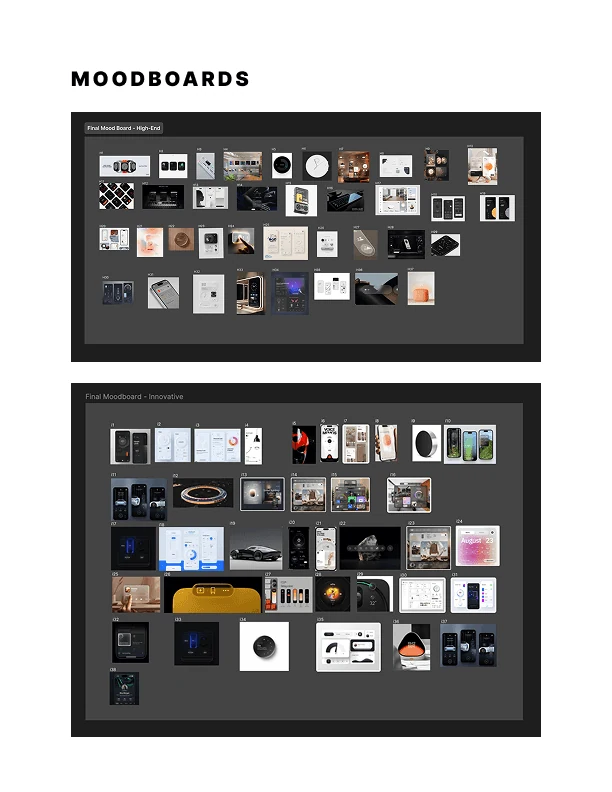
Explore the research criteria
Start with the device.
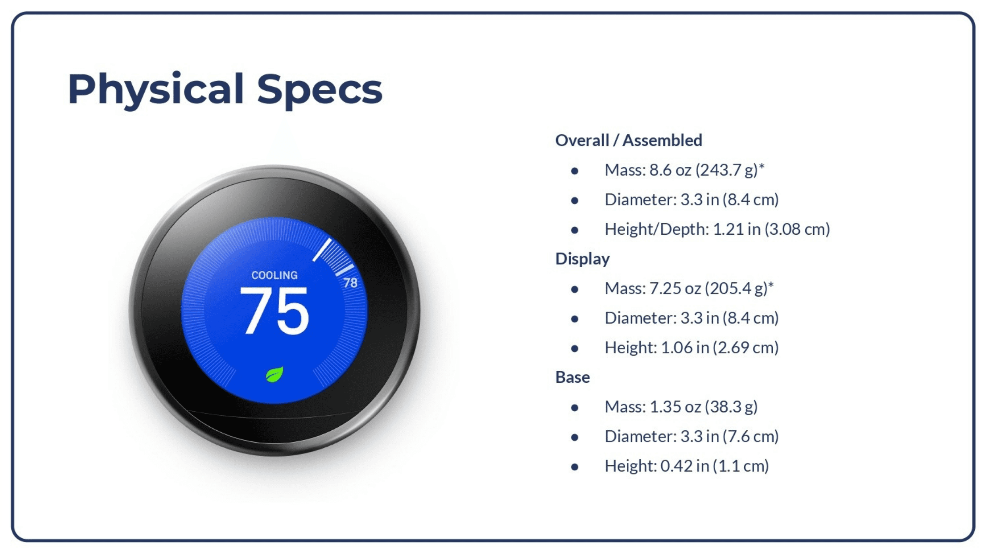
The physical thermostat provides the constraints: a circular display, a compact footprint, and information that needs to make sense at a glance.
Before the screens,
the sequence.
User wireflows / device & mobile
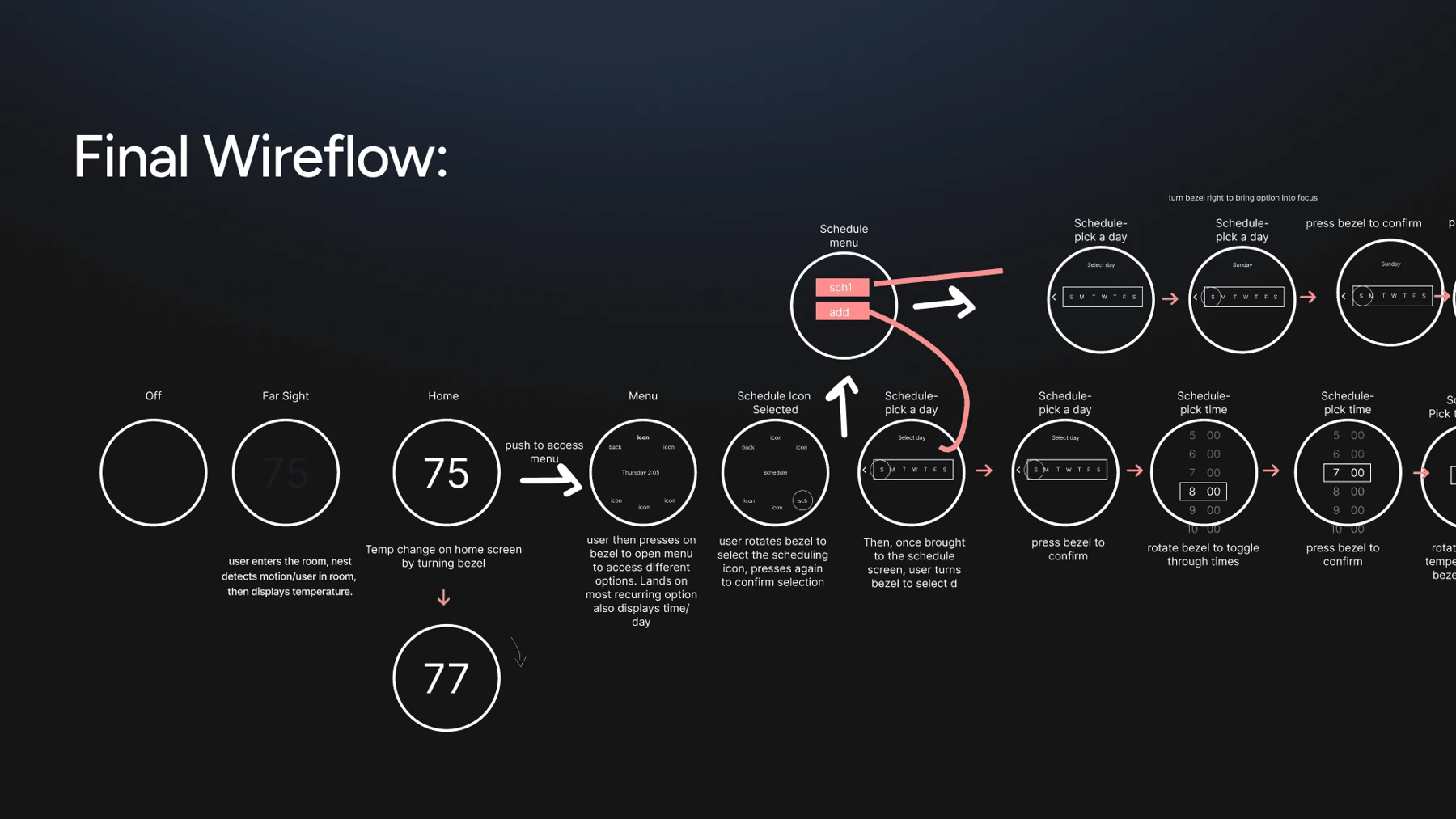
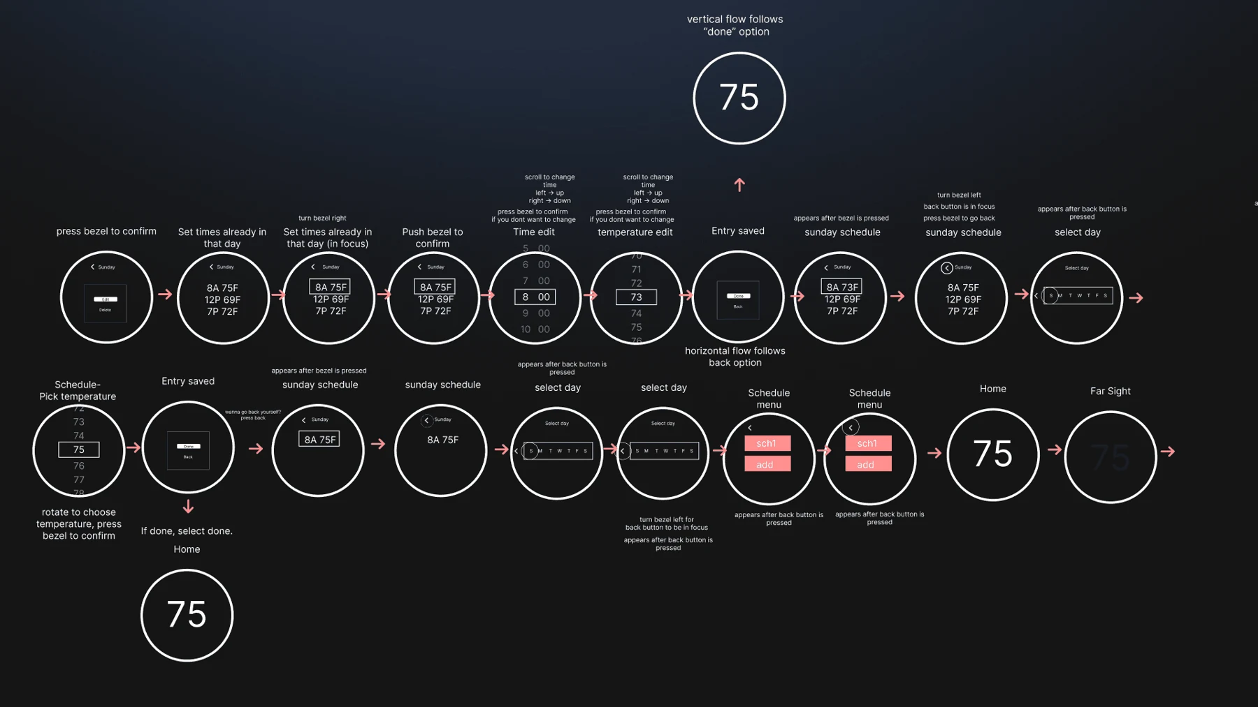
The wireflows map how a glance becomes an action: see the temperature, open a control, make an adjustment, and return to the home state. Scheduling adds a second layer—choosing a day, setting a temperature, and revisiting it later.
- 01Glance at home
- 02Choose a control
- 03Make an adjustment
- 04Return to comfort
See the expanded wireflow
Two surfaces.
One language.
Low-fi screens / iterations / components
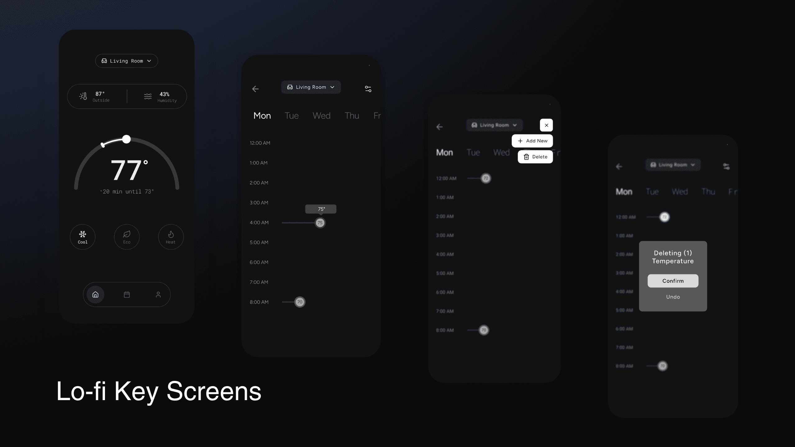
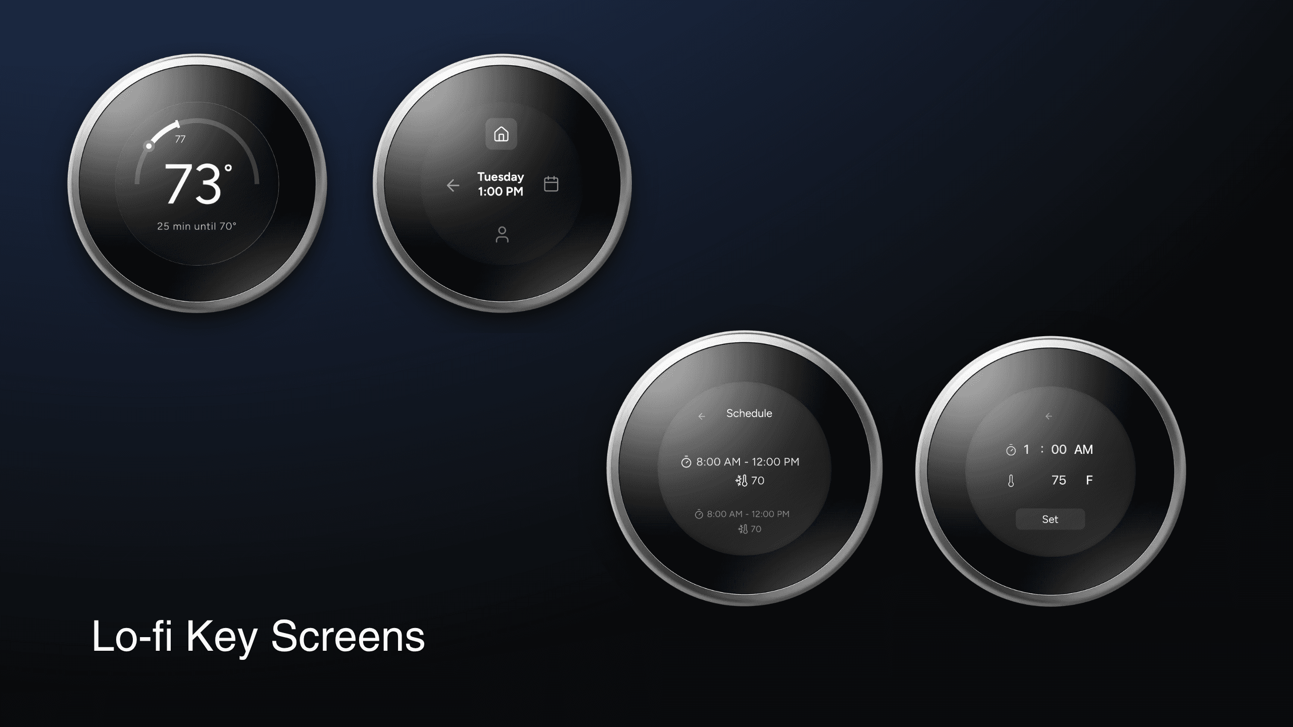
The circular device and rectangular phone need different layouts. Large temperature readouts, familiar icons, and a shared palette connect them, while each interface works with its own space.
Establish the hierarchy.
Early screens explore where the temperature sits, how supporting controls are grouped, and how scheduling fits into each device.
Refine the expression.
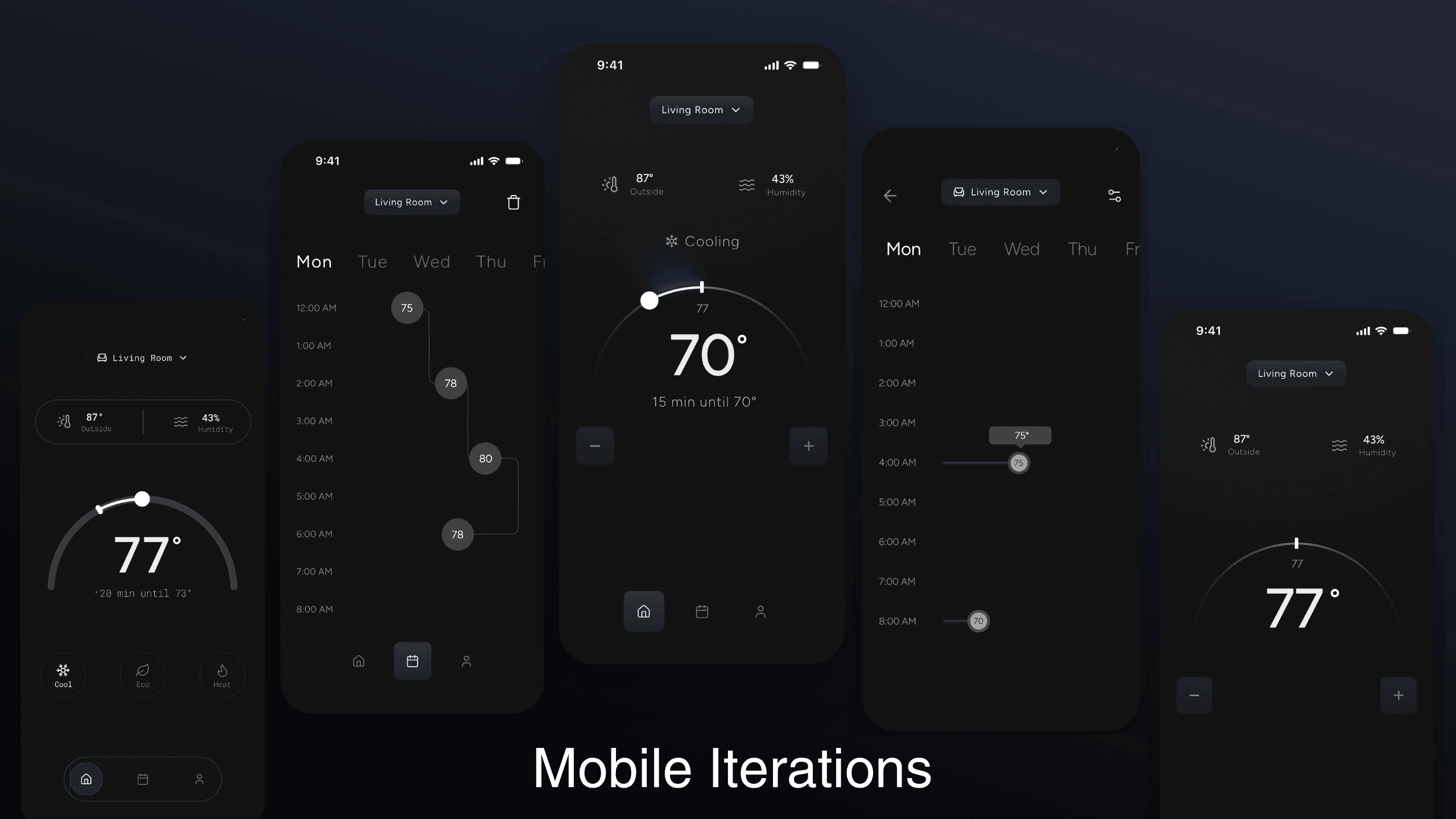
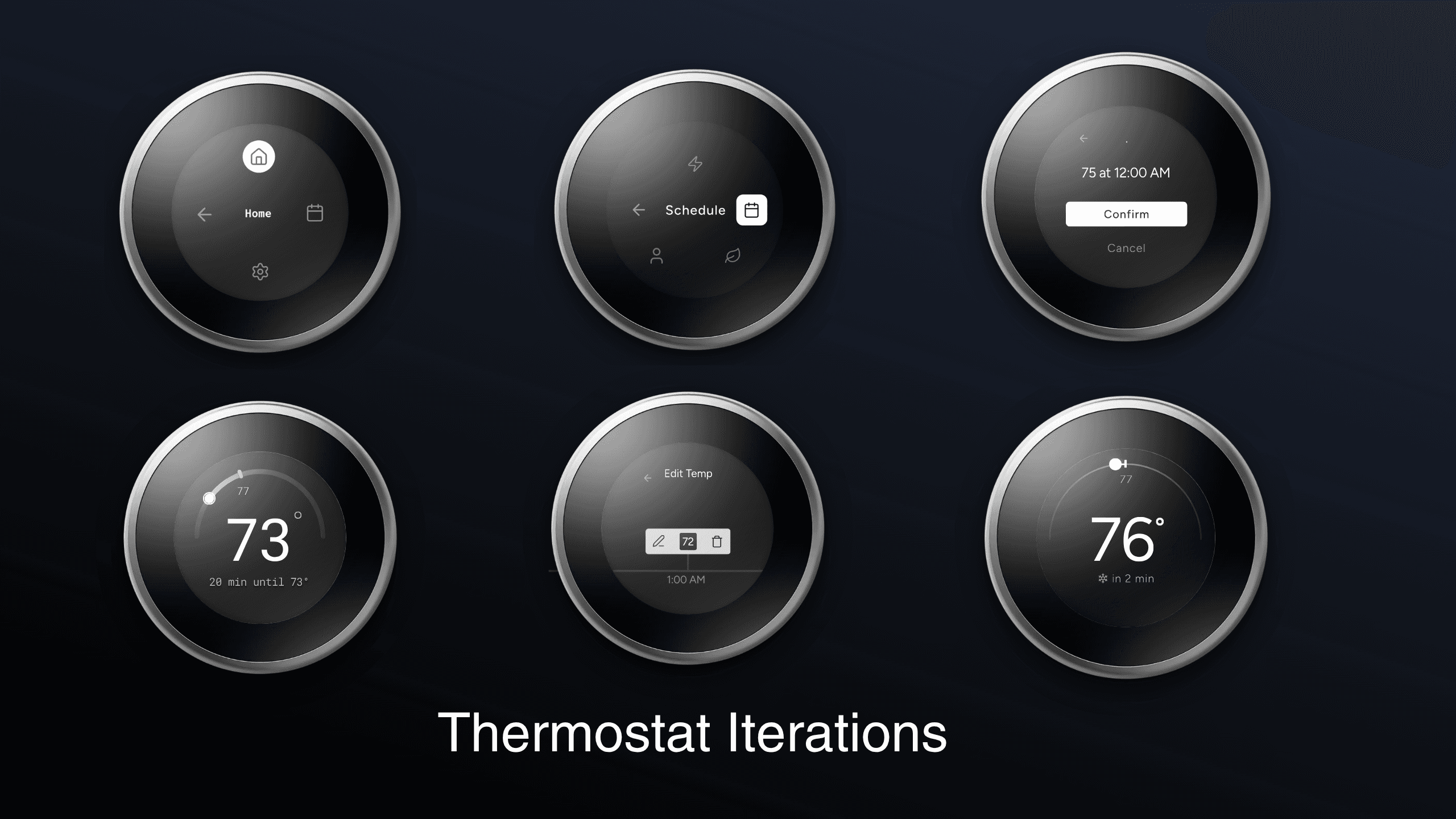
The iterations develop the temperature dial, menu arrangements, and the balance between a quiet background and a clear focal point.
Quiet foundations.
Clear signals.
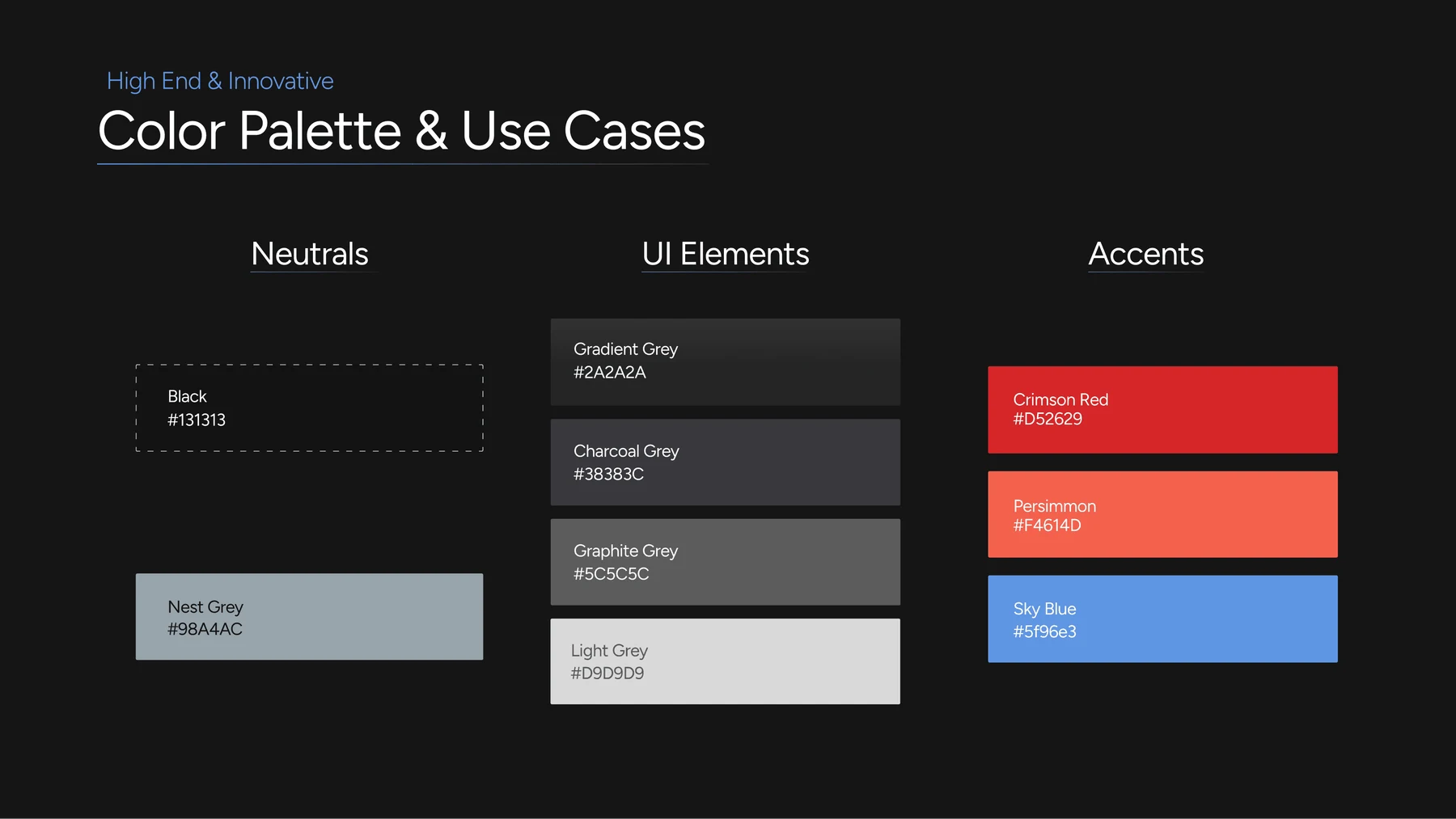
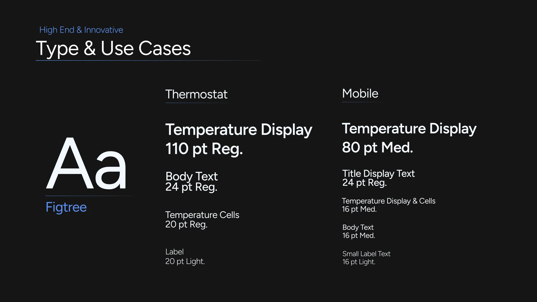
Neutral surfaces carry the interface. Red and blue provide temperature-related accents, while the Figtree typeface gives the device and app a consistent voice.
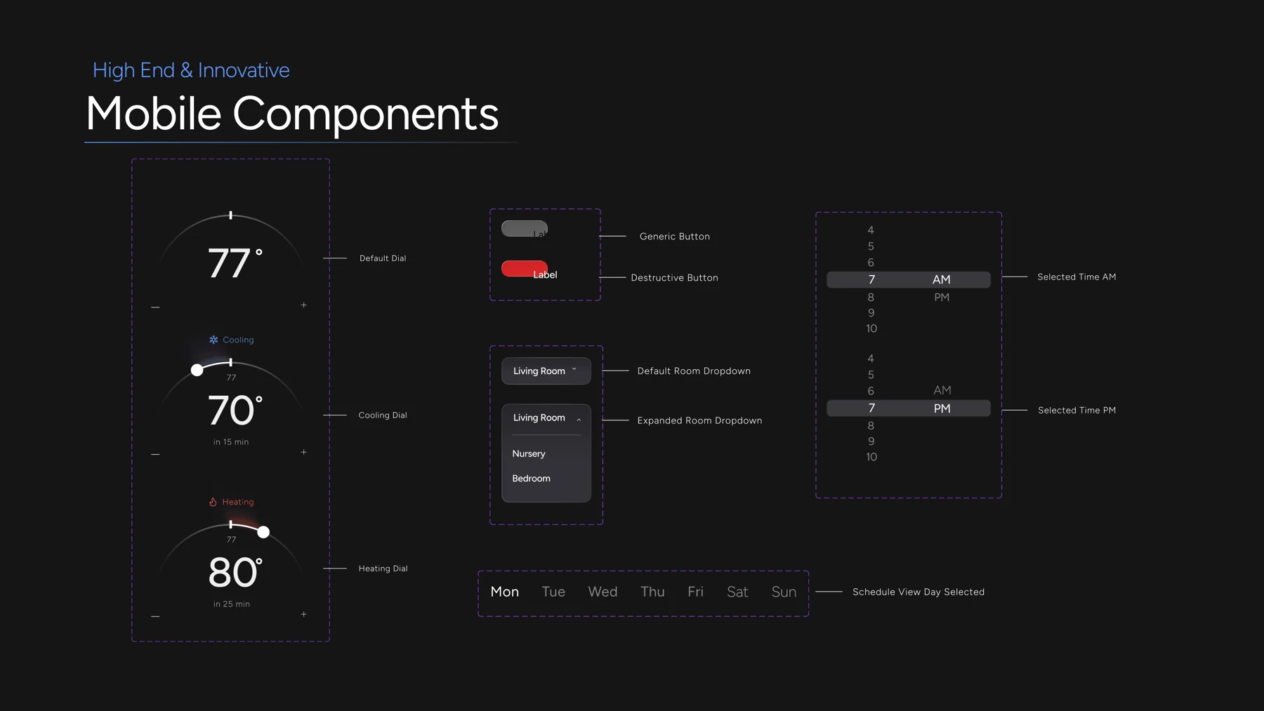
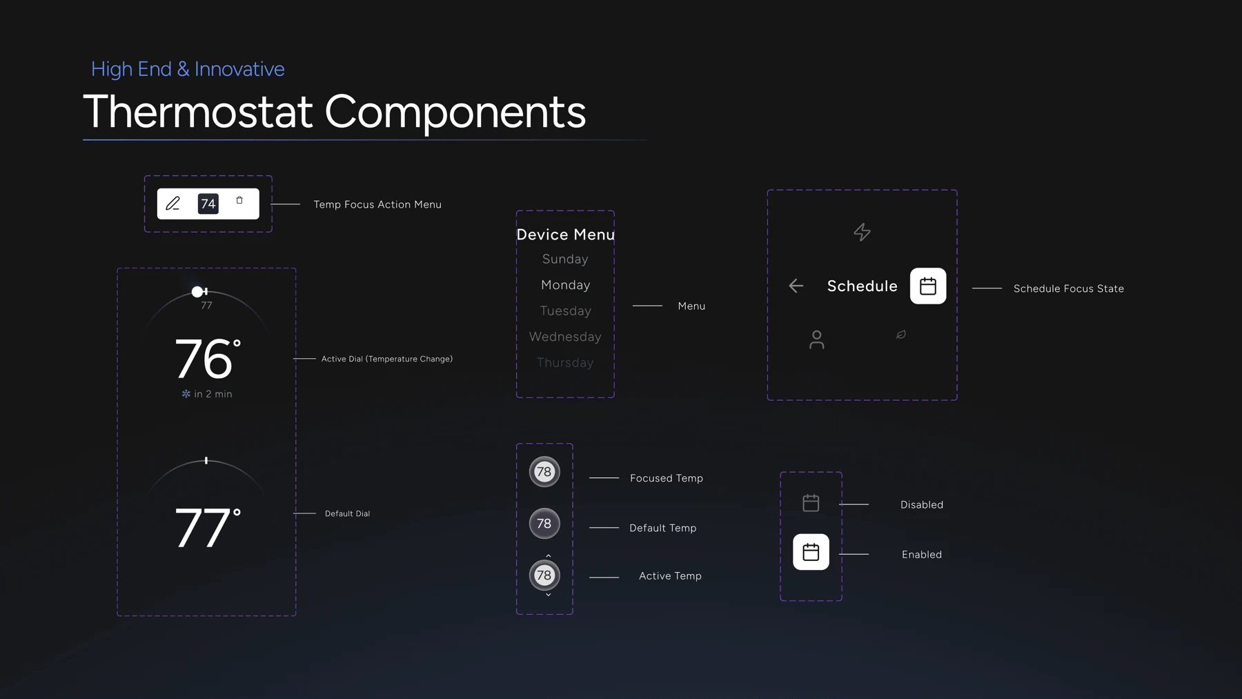
The component sheets bring together dials, buttons, navigation, and overlays, with separate treatments for mobile and thermostat controls.
Explore the component sheets
The connected
experience.
Thermostat / Mobile
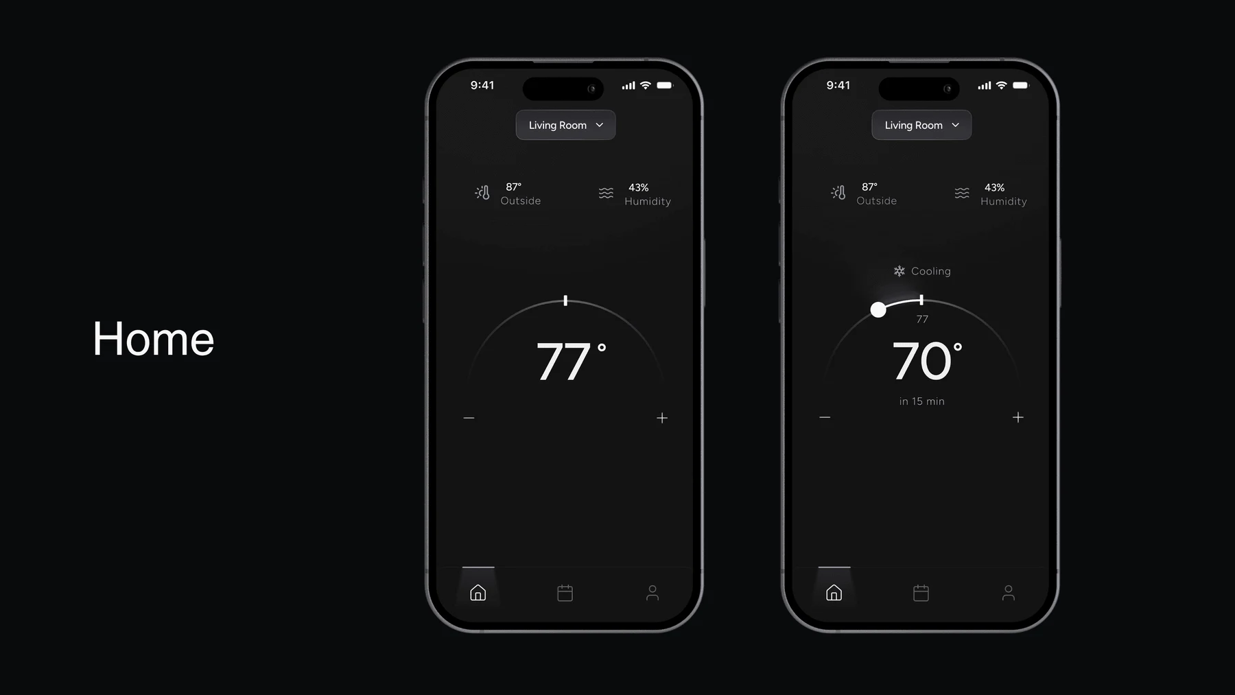
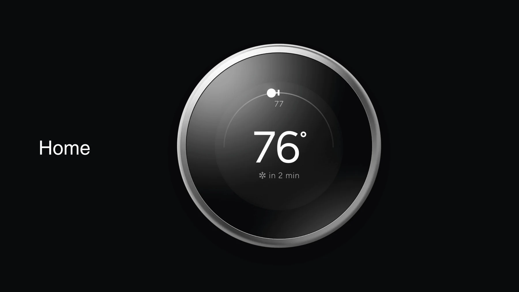
The final designs connect immediate temperature control with the routines of a home. Explore the key screens on each device, then see the prototypes in motion.
Comfort, wherever you are.
A familiar shape. A clearer focus.
See it in motion.
Temperature control, menus, and scheduling in the original interactive prototypes.